Popular instant messaging app WhatsApp has finally received a major design change – and it’s Material Design this time. The update is for Android only, and it’s not available through Play Store as of now. WhatsApp has released multiple updates on their official website in the last few days. We tested the version 2.12.38 and now 2.12.44 is already available. There are no differences in terms of design between those two, so the continuous release of updates means they are fixing minor issues and probably they will release it through Play Store soon. If you are an impatient user like me, then click on this link to download. Strangely, tablet devices are not compatible with the latest version, as of now.
The best thing here is that only the looks have changed, i.e all the settings, options etc. still are at the same place as it used to be, so there will be no difficulty in adapting to the newer looks – unlike Facebook which drastically changes the appearance from time to time. The only difference is that if you haven’t received the update with WhatsApp calling feature enabled, then the three column view will be new to you.
As this update is based on Material Design, it is quite obvious that all good things of Material Design will be present in the new update. Bright and light colors, cleaner looks, circular icons and animations – all of them make their way here and it results in an awesome final product.
Now that the update is official, let’s have a look at the changes introduced by WhatsApp.
Table of Contents
What’s different?
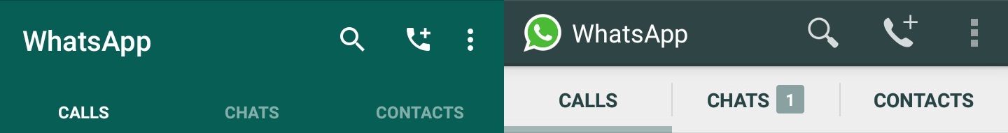
Icons for new call, new message, new contact :


The icons to start a new call, new message and add contact have all been changed. And now all the bars have a single green color, unlike the deep green and white.
No WhatsApp icon:
The WhatsApp icon, which was present at the top left of chats, profile picture, settings and status editor screens has been removed.
Message Input Field:
![]()
The message input field is now a floating box with emojis and camera icons on each end, and the mike symbol to record audio is a separate circular icon adjacent to it. In previous version, all these were present on a single white colored bar.
Mike icon to record Audio:
 Also, when you tap to record audio, the green circular icon becomes bigger. In previous version, the mike just got highlighted.
 The animation of a mike getting tossed into garbage bin is still there when the audio recording is cancelled by sliding to the left with an additional effect of the green mike icon getting back to its original position.
Attach Option :

The attach option to the top right of a conversation now opens up a different looking menu, complete with colorful icons. The new menu now takes up the entire width of the screen unlike the older one which looked like a smaller card and it pops out with a smooth animation rather than appear instantly.
Profile View:

Previously, profile picture used to be a separate floating card which could be accessed by clicking on the circular icon in the profile. Now the entire image, and other details like status, media, phone number, participants (for groups), etc are all on the same page.
 When you click the profile, a smaller image with the user’s/group’s name is shown. To view the profile picture completely, you need to scroll down.
 If you scroll up to view the entire details, the user’s/group’s name looks like the older title bar, but this time the background color will be a dominant color from the profile picture, and hence different user’s/group’s details look different.
Notification Bar:
One of the most interesting features of Material Design is how the color of notification bar changed depending on the current screen. And the color change happened with all the native apps such as contacts, dialer etc. Now the same comes to WhatsApp.

This is a very simple difference, but it gives an immersive feel to the app. Similarly, the color changes every time you view different users’/group’s profile details.
Circular badge notifications:
Again a simple change, but one that goes along the design principles of Material Design. The badge notification which indicated number of unread threads is now circular, not square like the previous version.
No dividing lines :

The older version had thin dividing lines in all the options, which is now a thing of past. The latest version has a single card like look for options, and it contributes to the cleaner look.
Settings :

The icons in the settings menu has also received a design change.
Update: (Topics mentioned below are the ones we noticed after this article was first published)
Option to create group:
A new option is present when you tap the ‘new message’ option on top right – to create a new group.
 There is nothing new or different, it’s just an option to create a group. You still have to tap on the conversation to type a message. Since it’s included in the ‘new message’ option, it would have been better if we could directly get into the conversation, just like clicking on any other contact.
Option to report spam:
Until now, if you received a message from someone who is not in your contact list, you just had the option to block or add them.

Now, the option to add contact has moved down and a new option to report spam is also present.

That’s it! These are the changes we observed in our brief testing and it’s impressive. The profile view is a welcome change, attachment menu looks modern, and the color changing notification bar adds to the experience. But the option to create new group is pretty much useless in its current form. The version tested by us was 2.12.38 and at the time of writing, version 2.12.44 is available. If you receive a later version and observe more design changes than those mentioned here, then do let us know by commenting below.
[follow id=”ashishmukundan” size=”large” count=”true” ]